Point Park alum practices hypnosis, develops new methods of therapy

“You are getting very sleepy,” is not a phrase you will hear at the Pennsylvania Hypnosis Center in Wexford. There are no pocket watches in the vicinity, and president and mental trainer Daniel Vitchoff does not put you in a trance to make you quack like a duck or act like a monkey.

“There’s some people that make it a stage show,” Vitchoff said in a phone conversation one sunny afternoon in November. “Anyone can go out there and say they are a doctor, say they are a hypnotist. It’s hard to overcome what you may have heard or seen on the Internet.”

The hypnosis practiced at the Pennsylvania Hypnosis Center is a strict, disciplined therapy program focused on helping patients overcome struggles with weight gain, smoking, anxiety and more.

“What we do is we help people fix issues that they can’t do on their own,” Vitchoff said. “Typically, these are issues that they have a common sense solution, such as put down the cigarettes and don’t pick them up again, quit worrying about the airplane [going down]. This is for people who know what their issues are, but their subconscious mind is programmed to keep them off track, really doing the opposite of what they know they should do.”

Vitchoff, who graduated from Point Park University with a bachelor’s in Psychology, entered the field of hypnosis to overcome his own learning disabilities and mental blocks regarding focus and information retention. After discovering the “power of music,” and how pairing melodies with information helps the brain retain information better, he was exposed to hypnosis by Psychology Professor Robert Fessler in his Theories of Personalities course.

“Dr. Fessler really sticks out in my mind because he was such a tremendous educator,” Vitchoff said. “The way he delivered his class was through the use of sort of hypnotic language. He had you hanging on every word, he almost forced you to learn what he was saying.”

After graduating and working several different jobs, he then used his own tricks of mental training with music to develop a special practice of hypnosis called the 33 Method. The patented method, which he and his National Guild of Hypnosis-certified employees practice at the Pennsylvania Hypnosis Center, uses phrases specifically tailored for each patient matched with a music playlist to specifically target the patient’s problem areas.

“Through different types of language patterns, the way you talk to someone, it opens up the subconscious mind,” Vitchoff said. “Not just the words, but way it’s phrased can bypass the mental barrier. Certain types of music and tones with the words is a lot more powerful, certain types of words or sentences said in specific ways.”

In this way, Vitchoff or his associates would use negative phrasing and tone of voice when speaking about cookies or fattening foods to a patient trying to lose weight, as well as positive phrasing and lighter tones when speaking about vegetables, for example. Additionally, Vitchoff said the brain has a better chance of retention of information if repeated in threes, which is where the name for the method was contrived.

“We’ll tell them something three different ways – like non-smokers will be healthier, happier and have more energy. They’re going to remember that.”

While Vitchoff is known in the area as “the guy who can help you quit smoking,” he is internationally known for his work with Olympic athletes. His focus for the athletes is to help with mental training and preparation for success, such as helping the athletes find their “zone.” This can also be achieved using the 33 Method.

“The cornerstone of my success has been being able to help them, under the most intense pressure, in the moment of their life that they’ve prepared for since they were 5 years old, to actually be calm and get in the zone,” Vitchoff said. “The end result is they are able to perform under pressure – we call that the zone. The brain slows down everything to the point where … any distraction that’s around you, you don’t notice.”

Vitchoff has also developed a patented machine specifically for athletic mental training. Named The Original Mind Gym, this compact, zero-gravity chair combines visual stimulation of a touch screen computer, special light set-up, as well as music stimulation and relieved pressure on the spine for a feeling of weightlessness. Vitchoff said the Mind Gym is the mental equivalent to practicing a workout regimen.

The Original Mind Gym works in a similar way to the 33 Method. Through repetition of scenarios, the brain develops a substance called myelin, which sends messages directly to the brain of these patterns of movement. It can be developed for things like driving a car, athletic movements like throwing a football, or even of giving a public speech.

Vitchoff plans to introduce the Mind Gym to the Pittsburgh Steelers in the next year, and also has plans to make it available to the general public.

Vitchoff also has a contract to work with the 2012 Olympians, and is currently developing a program for veterans struggling with post-traumatic stress disorder.

“After the Olympics, my passion is going to be really being able to help those men and women that come back from something nobody can see, these scars that nobody can see. They’re living a really hard life,” he said. “Their myelinating of the brain is to go into panic mode. [Hypnosis] would help them wire their brain to relax and adjust to the stresses that you and I go through.”

And all of this, he said, is a direct result of his studies at Point Park.

“I give so much credit to Point Park, I treasured my time there,” he said. “Everyone there is so great, they give such personal attention, and it’s how I got here.”

Pittsburgh Penguins’ Interactive graphic

By Adelyn Biedenbach, Leanna Talarico and Colleen Ferguson

Our idea  is to turn the Pittsburgh Penguins’ statistics, based on this website, into an interactive web graphic. The main data that we would focus on would be individual player stats, including games played, goals scored, assists, points and +/-.

The way we would like to show this is through individual players being made clickable. As the skater comes to the forefront, his individual statistics would be featured, instead of listed in a chart like this page of the website. Clicking on the player would also make him move, making the graphic more engaging and the statistics more accessible.

Where are CNN’s interactive graphics?

I’ve been following CNN as a news source fairly closely and loyally for a few years now, and never more so than these past few months. There are some things CNN does really well – video, of course, being primarily a broadcast news source; its text-based stories are also really well written and informative. Both of these ensure I am getting the most up-to-date information about any breaking news event or topical situation.

One thing I have noticed CNN does not do as well? Multimedia. I have struggled to find anything beyond a photo slideshow for additional multimedia, and information graphics are all but not existent. And interactive graphics? I don’t think CNN has produced one in over a year.

The most recent interactive graphic I could find was when the organization covered the census poll conducted by the government in 2010. In its first interactive graphic since the 2008 presidential election, this graphic serves as a source of information to readers about the changing state of the nation, economically and population-wise, as a result of the findings of the census.

I think this graphic is really well constructed, despite a few flaws. I especially like how the map can be personalized through a drop down bar, which allows the user to determine if they would like to see results of population change:

Or how the economy has changed by state over the past 10 years:

Additionally, with each of these specialized views, more statistics can be chosen to highlight. The user can determine if they would like to view the information by county, state, or census tract. For population, it can also be broken down further to highlight specific demographics:

At the same time, some of the information is not entirely clear for the user. The graphic uses a color scale to represent data, but the key to explain the colors is not detailed enough. For this example of total population, the key, which also changes for each personalized selection, says the lightest color of orange represents 0, and the dark orange represents 37,452. Common sense tells me this number must represent people per square mile, but it is never made entirely clear, therefore the user is always wondering what information he or she is looking at.

Despite the struggles with the key, this graphic is really easy to use, highly informative and relatively easy to understand. The ability to specialize how the information is represented – by state, county or census tract – also depicts the level of depth CNN reporters went to gather this information. This blocking technique also allows the user to determine how he or she would like the information on the map to be visually represented.

This graphic is more of a source of information, rather than a stand-alone news source. If I were to write a story about the census, I would turn to this map for visual elements, or for a visual representation of specific numbers acquired for the story. The confusion with the key does not allow for the graphic to stand by itself. Also, the graphic cannot zoom into specific locations to provide minute details of local areas. This leaves the reader only able to access information on a national level, where local levels might be what the reader is looking to discover. Adding an additional feature for the user to look up specific census numbers for a local area would have made this graphic a stand-alone piece.

Vandana Shiva visits Point Park

Dr. Vandana Shiva visited Point Park University last week to discuss her views on globalization developments and the importance of local farming techniques. Check out an audio slideshow of her visit below.

CHANNA NEWMAN: Good evening, and welcome to Point Park University’s fourth annual Global Cultural Studies speaker series. Dr. Vandana Shiva, our guest tonight, has been demonstrating convincingly through her work, her books, and her speeches, that the interestests of the peple of this earth are critical to the survival of the planet and essential to our independence and well-being.

NARRATION: Pioneering the Navdanya movement in her native India, Shiva fights for the empowerment of local farmers and diversity of farming. Addressing a standing-room-only crowd in the GRW Theater on Wednesday, Nov. 2, Shiva shared her support of technologies that proves the ecological value of traditional local farming, as well as fight against big globalization and development projects.

VANDANA SHIVA: The monoculture of the mind has become such a severe threat to the future of the world. It’s become a severe threat because it’s allowing that rule of the 1 percent. Because that 1 percent arrogates to itself the power that only my mind counts, only my wealth counts, only my decision-making counts.  It is impoverishing the world democratically, it is impoverishing the world ecologically, it is impoverishing the world economically. And the only way we can get out of it to put the earth biodiversity, people and their diversity, at the center of creating what I call earth democracy, the democracy of all life on this planet. Celebrating the capacity of every being, every person.

NARRATION: Many Point Park University students were given the opportunity for extra credit for sociology classes by attending Shiva’s speech. One student will be writing a paper about how Shiva’s lecture related to topics explored in her class.

AMANDA SCHUTZMAN: What stuck out the most to me was when she mentioned about the number of farmers that commit suicide because of the effects of the different organizations and what they have on their farms.

NEWMAN: Can any of that genetically modified stuff be reversed?

SHIVA: When you start doing organic farming, for example, within two seasons, the soil organisms start to come back, the toxins start to go down, so what basically happens is when the healing starts to takes place, or ecosystems of soils or people of society, you get a shrinkage of the space of the toxic. I think we will create another future. You bring back crops that they haven’t genetically engineered, you’re whole ecosystem goes in a different ecological and evolutionary path, so I think another future is possible.

“We cannibals don’t like to be kept waiting”

It’s dark – the kind of dark that makes you stretch your eyelids as wide as they will allow to give the illusion of better sight. Splintered wooden railings guide the next victim to the entrance. Warm, shaking bodies press together in the twisted line – partially to combat the chill of the dank underground waiting chamber, but mostly out of fear. In the distance, a bright spark blinds even those in the back of the line, but those at the front are given a full view of a buzzing electrocution chair claiming its next victim.

You always keep an eye on the unnerving characters roaming amongst those in line: a deranged dock worker with a piercing, shrieking laugh; a disturbed proctologist who hungrily eyes those in line – his next patients, if you will; a silent stalker, dripping in blood with a habit of sniffing the necks of those nearby.

As your eyes adjust to the dark, a sign can be made out near the entrance of your next destination. It reads, “Maggots Funeral Home,” and it is where you will spend the next 45 minutes dodging cannibals at a new Halloween attraction in the Strip District. Welcome to Terror Town.

The career of Michael Jackson – through sight and sound

It’s always easier to critique a bad presentation than a good one, and that’s just what I’m about to do.

I’m not really a huge fan of Michael Jackson, but I stumbled across this audio/visual presentation about the career of the Prince of Pop a couple weeks ago when all the media coverage about his doctor’s trial was taking place. And while I don’t know a single person who won’t sing along to “Thriller” or “Billie Jean” when they come on the radio, I think his full career spans a lot larger than the casual listener can appreciate. With this slideshow by CNN, originally published back in 2009, there was a lot of opportunity to delve into his lesser-known catelog, highlighting the man’s true pop artistic genius instead of just highlighting the most popular hits.

The visuals for this aren’t exactly riveting. Utilizing mostly only covers of his singles as they play in the background, the images presented are ones even the pop culture-deprived would recognize. In the times after his death, we as fans and consumers of media appreciate being presented little-known facts or rarely seen memorabilia from his life, which this presentation fails to do.

Additionally, as I already mentioned, most of the singles highlighted are those everyone would recognize. If I as a consumer am going to invest two minutes of my time into watching this video, I would prefer to gain something from it other than a feeling of sadness. Of course, this may have been the intended purpose of the video in the first place – after a famous icon passes, the media tend to pounce on the emotions of the public as a means of driving traffic to their respective websites.

This video does, however, provide interesting information in the brief captions. Despite my desire to see more photos accompanying each caption, the captions themselves give detail where the visuals are lacking, such as the fact that Jackson’s first single “Ben” was used as a theme song for a movie by the same name.

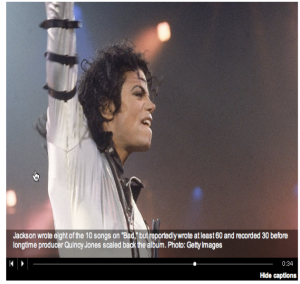
In one instance, however, I found myself wishing to learn more information than the brief captions could provide. For example:

A whole story could be written about this quick caption. In fact, perhaps a better use for this audio slideshow would have been to accompany a text-based story, such as an obituary, detailing the life and recording career of Michael Jackson. Again, after a celebrity’s untimely demise, I find myself wishing to learn more about the artist, not reminisce on information I already know. In this case, an interesting story about Jackson’s process for writing and recording his popular, and not-as-popular, tunes, which this caption hints at, would have worked well with this presentation.

Overall, this video seems quick and sloppy – like CNN’s attempt at being the first to have a “Michael Jackson remembered” page with content. It doesn’t serve a true purpose, nor is it very well made, featuring stock photos and captions with information that could have been found on Wikipedia.

Additionally, as can be seen on the page, a section for comments is lacking. If this video’s purpose was solely for fans to stop and remember the superstar, a section for viewers to post their comments should have been provided. Otherwise, what is the point?

Pittsburgh farmers markets prepare for changing season

Farmers markets are great summer events. The market on Thursdays in Downtown’s Market Square is the perfect stop for a lunchtime bite, with its fresh summer produce and prepared foods.

Many markets, including the Market Square weekly, continue well into the fall months. When the summer fruits and vegetables begin to disappear, market vendors change their produce and methods of harvest to keep up with the demand from weekly customers.

These vendors have some interesting new products coming out for October and November, as well as unique methods of maintaining a strong produce line for the fall. Find out more in the video below.

Narration: While farmers’ markets are considered by many to be a mainly summer event, many market vendors are preparing for the fall season. Many markets in the area, like the Thursday farmers’ market in Downtown’s Market Square, continue well into the fall months. Changing seasons means changing produce and a new selection of winter goods offered by vendors.

Rob Shelley: we go from apples to this kiwi berries, figs, we have fall raspberries, so just the season of vegetables and fresh fruit changes. It actually gets better in the fall.

Larry King: What we would call winter vegetables, which would be fall squashes, cabbage, greens like collard and cale, leaks, red beats, potatoes, that’s all new in the last say two weeks, that usually starts in the last week of September.

Nicole Kubiczki: Right now we’re getting a bunch of fingerling potatoes in, some sweet potato fingerlings, some Peruvian adorondac blue potatoes.  We grow about 10 different types of squash, so right now we have about 8 types of squash, as well as turnips. I think people kind of want that comfort food when it comes to the fall, so our roasting cuts of meat, we have grass fed beef, and so some of the roasting cuts for that, as well as lamb. And this fall, we’ll also be doing some pig. So different types of comfort food. Then as the produce starts to die down, I think our sales for the cheese, the eggs, the organic grains will all increase.

Narration: For others, fall is the peak selling season for other types of products.

Nancy Hellman: Our products remain the same through the summer and the fall, but since we sell a lot of soups and rices, this is the time for us.

Narration: The same produce is not always available for the fall, so vendors apply creative ways of keeping their product viable in the cooler season.

Kubiczki: We’ve been trying to look into doing value-added products, so we dropped maybe 5000 pounds of tomatoes off at Punxatawny to make salsas as well as tomato sauce. We’re at the Pittsburgh public market, which operates year-round, and so we’re still able to be viable and sell our product throughout the year.

King: Some of the more costly things, like tomatoes and some of the lettuces, we use a fabric cover, which keeps the frost off of the produce. It’s a material, almost like a very thin t-shirt, and its light enough that it doesn’t smash, it’s kind of like putting a blanket over. You can leave it on during the day, and it increases daylight temperature by about 12 degrees, and nighttime temperature by about 8 degrees, so it keeps the frost away.

CNN – lots of media, not as much multi

CNN is becoming an internationally respected institution for news. With correspondents all over the globe, most Americans, including myself, turn to CNN first for updates of new happening nationally and internationally.

CNN seems to have one major downfall keeping it slightly behind the times. While it grows as an institution, it hasn’t yet expanded enough to take advantage of all ways consumers are finding the news today.

The front page is divided into three columns and what consumers see initially is two columns of photos, some body text and a middle graphic of video. Structurally the box of videos are in the middle of the page and feature a variety of topics ranging from Barry Manilow to NCAA to SUV reports.

At first glance it seems as though cnn.com has a number of multimedia options. I clicked on the first photo/video feature that caught my eye. The link,http://sportsillustrated.cnn.com/2011/writers/andy_staples/09/13/best-picture-winners/index.html?hpt=hp_c2, went to the cnn affliated sports illustrated. The link used multimedia well as part of the narrative, covering the college football games and upcoming matches. However, it took me a minute to notice that I was no longer on CNN’s site.

The link did not open in a new window, which I think is a mistake of CNN because I then had to mindfully navigate back to the CNN homepage.

When I returned to the homepage I noticed a column of video clips in a scroll bar across the bottom of the page. These videos were clips and condensed versions of CNN television shows.

Clicking on a video will take you to the CNN video player, featuring forward and back arrows to navigate through clips.

The video player features clips on a variety of topics, but is a single medium. Almost none of the videos had stories or photos with them as they were designed to be stand alone pieces. They work as stand alone video pieces on television, but I think in order to adapt to the web other elements would have been useful to enhance them. Even something as simple as links to outside sources or previous coverage of the topic could go a long way.

Back on the home page, I came across the NewsPulse tab. I think this tab does a wonderful job of showing popular stories and timeliness all in one easy-to-read shot. The page shows a customizable most read and social media shared stories of the past 15 minutes. The columns show the last time the story was updated, the number of comments and the number of Facebook shares.

I like the organization of this page and the way in which it utilizes the public opinion to share stories and to rank them in importance and relevance to CNN’s viewers.

Looking throughout CNN.com’s page it seems that overall they have a number of video clips and photos, but none of them really seem to pair together in reporting the news. Each piece works well as a stand alone, but a combination of the media could be an improvement.

Multimedia and me

Over the past 20 minutes, I have written and deleted what would have been countless introductory posts to this blog. Certainly the hardest part of any new endeavor, I have found, is actually getting your brain in gear and beginning, especially if the initial topic or focus is still unclear, as it is to me.

Since I am still not sure what precisely this blog will be about, I suppose the best place to start would be to introduce myself. My name is Colleen Ferguson, and I am an undergraduate senior print journalism and multimedia double major at Point Park University. Over the past three years, I have watched the School of Communication within the University develop and grow to accommodate and better prepare students to enter the changing field of the media. As newspapers all over the country continue to die out, online publications are booming and overtaking even the tried and true news sources.

Ever since I was young, a naive pre-teen stupidly (and probably dangerously) “hanging out” on these new things called message boards, I found the Internet to be a fascinating place. As I grew older, I began to understand its potential as a news source and fully appreciate the new perspectives to be found around the world wide web. Not only are national and international news literally at your fingertips, but that news can be presented through any desirable medium – text, video, audio, graphics and interactive elements.

It’s the interactivity that most fascinates me. The new hot topic word of the industry is “multimedia,” and the concept of presenting the news through a combination of media is appealing and exciting to the dying print publication industry. But multimedia, I think, should be more than just presenting the facts in several different manners. Yes, a great graphical element to support a statistic in a textual news story makes the information more accessible to readers. Yes, the Internet has the capability to support any representation of information we can imagine, and even some that haven’t been imagined yet. But the key to making multimedia elements of a news story successful is how the information engages the reader.

With the Internet at the level it is now, with access to information half way across the world accessible in just a few clicks of a mouse, information is not scarce. New perspectives on that information is, however. This long-winded post, in essence, is meant to say that interactivity is the key. Readers, myself included, are looking for a conversation about the news and facts, to be presented the information and have the opportunity to peruse it at will and draw our own conclusions, while it also looks pretty and it technologically dazzling.

This is what I hope to learn in my last year at school, and this is what I hope to bring to the world when I get the opportunity.